Use Colors To Your Advantage
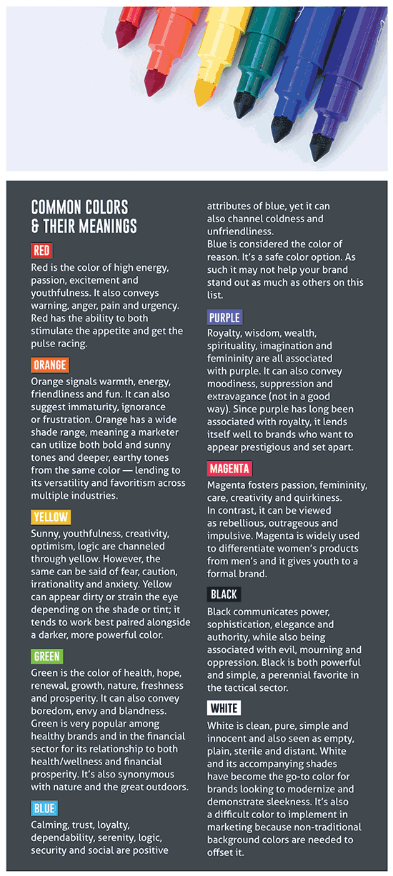
“People make up their minds within 90 seconds of their initial interactions with either people or products. About 62–90% of the assessment is based on colors alone,” wrote Satyendra Singh in a 2006 study (“Impact Of Color On Marketing”) for the University of Winnipeg (Winnipeg, Canada). “So, prudent use of colors can contribute not only to differentiating products from competitors but also to influencing moods and feelings — positively or negatively — and therefore, the attitude toward certain products.”
Keeping the above quote in mind: Have you ever driven past a McDonald’s and gotten a sudden craving for a Big Mac? It’s not just their Dollar Menu prices reeling you in. Those “Golden Arches” are actually manipulating your mind by pairing optimistic and happy yellow with urgent, appetite-boosting red to create a color palette your brain (and stomach) psychologically can’t resist. Interesting, right?
Over the past two decades, thanks to the rise of social media and the growing consumer reliance on visual media, both marketers and researchers have come to realize just how much of an impact color selection has to brand and product desirability and consumer confidence.
The Point Of It All
So, what does this mean for any rebranding efforts or marketing materials? You probably already know not to use Caution Yellow as the primary color for a women’s seminar flyer — but did you know the effects of color psychology can be more subtle?
Depending on how colors are used (and what other colors they’re paired with) they can have the opposite of their intended effect — not something you want to learn the hard way after printing 500 copies or launching a new logo.
Taking a look at the sidebar, you can understand what types of messaging Ruger conveys with its iconic red logo, or why The Well Armed Woman chose purple, Girls With Guns Clothing magenta and Vortex black.
Pantone (a leader in standardized color matching) annually releases its Color of the Year. To describe Classic Blue, Pantone’s choice for 2020, the words “calm,” “confidence” and “connection” are used. Given its sense of security and trust, you really can’t go wrong by including some shade of blue in your marketing plan — unless you’re in the food industry.
Color selection is an important, but often overlooked aspect of marketing. Here are three ways you can incorporate the benefits of color psychology into your business.
1. Branding & Digital Marketing
Before starting a new branding or digital marketing campaign, think about the feelings and emotions you want to evoke from the intended customer/audience. Knowing how you want them to feel and what you want your brand aligned with will go a long way toward defining a marketing plan.
For those new to the industry with an innovative new product, look to colors like red, orange or yellow to encourage thoughts of excitement and creativity.
If you’re an outdoor retailer who’s been in the business since 1970, opt for colors like green to correspond with nature or brown to imply ruggedness and durability.
Color psychology is more about the perceived appropriateness of the color selection in relation to your brand or product than it is about the emotions, so a target manufacturer should probably stay away from white or silver hues; they don’t convey excitement or caution.
2. In-Store Advertising
Here’s where you can really play around with color psychology and even run a real A/B campaign to see which colors increase sales or encourage more customer interaction.
Advertising can be as simple as product layout and floor design — like putting some aqua, pink and lavender items in a layered display in front of the women’s section or stacking boxes of bright orange clay pigeons and Blaze Orange products at the entrance during bird season.
It can also be a more complex, “big picture” color coordination like matching the shades of in-store signage to employees’ uniforms or switching out the dull off-white linoleum for a calming blue carpet.
Whichever method you choose keep it simple, too many colors can be overwhelming. While we would all like to exude power, excitement, friendliness, wisdom, compassion purity, we can’t do it if there’s a rainbow of colors going on inside the store or across social media accounts.
The goal of color psychology is to reinforce customers’ beliefs in the brand and to evoke one or two emotions, not to confuse them and distract from the mission.
3. Product Coordination
This may be the hardest area to correctly implement color psychology because you don’t want to create durable, long-term products in colors that are too trendy, but you also don’t want to miss an opportunity to make the product stand out and speak to the customer from the shelf.
Being an Arms & The Woman article, an important caveat is necessary: Just because purple and magenta are more synonymous with femininity (and, in general, preferred by more women than men) doesn’t mean every product you create for women has to be inclusive of these colors.
Due to the growing number of women hunters and shooters, the demand for feminine designs that don’t compromise functionality is rapidly increasing. Not all women want a Ballet Pink handgun or a purple gun bag, and no one wants those products if they have half the quality of men’s products. Designing or offering products that scream “This is for girls ONLY!” without offering other options less “pretty” but still functional will only pigeonhole your store as one that only caters to women who like pink or who are soft. It’s not a good long-term marketing opportunity.
If you’d like to add pink or purple accents to products marketed toward female customers, consider adding those accents to removable packaging or less than 50% of the product itself.
Bonus: Shades & Tints
A new marketing concept geared toward women is the shades and tints trend. Studies have shown women tend to prefer tints of colors (those with a white base), while men tend to prefer shades of colors (those with a black base).
While Blaze Orange may not seem like a color likely to attract women, a Mango Orange tint may be more effective. Caution Yellow can be off-putting and decrease sales, but Sunshine or Butter Yellow may increase engagement with female customers.
Remember: The key to successfully using color psychology in marketing is to identify how you want the customer to feel about your brand. Now, grab a 64-count box of Crayola crayons and get to the drawing board!