No One’s Patient Enough for a Bad Website:
Practical Lessons from Firearms Retailers Doing It Well
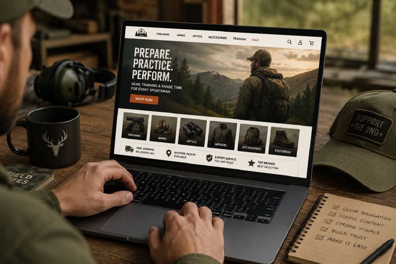
A sale often starts here. Make it easy.
A customer lands on your website with a job to do.
Maybe they’re looking for a specific firearm. Maybe they want to compare training options. Maybe they’re trying to figure out whether your transfer process is simple enough to handle today, or confusing enough to become tomorrow’s problem.
Either way, they’re making decisions fast.
Strong retailers understand that a website is often the first real sales conversation a customer has with your business. Before they call, visit, or add anything to a cart, they’re already deciding whether you feel organized, trustworthy, and easy to work with.
The good news? Improving your website doesn’t always mean starting from scratch. Sometimes it’s about making the experience easier for the person trying to use it.
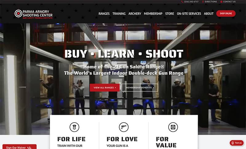
Visitors to Parma Armory get answers immediately.
Help People Get Their Bearings
Parma Armory (Parma, Ohio) does something simple but important right away. Their “BUY • LEARN • SHOOT” message quickly tells visitors what kind of business they’re dealing with.
That matters because people are trying to orient themselves fast. Are you a store? A range? A training facility? The faster they understand that, the faster they can decide what to do next.
Parma also uses visual navigation well. Some menu sections use images, featured programs, and clear groupings instead of endless text links, making the site easier to scan, especially for customers who aren’t quite sure what they need yet.
Their NSSF First Shots beginner program and family gun safety training are easy to find, and that matters for a practical reason: first-time customers are often looking for reassurance as much as information. If someone is curious but a little intimidated, clearly featuring beginner-friendly programs helps lower that barrier and makes it easier to picture themselves actually walking through your doors.
A good website should work a little like a good salesperson: helpful, clear, and already thinking one step ahead.
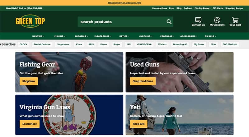
Green Top Sporting Goods' website offers easy navigation.
Not Everyone Shops the Same Way
Some people go straight to the search bar. Some browse categories. Some click whatever catches their eye and insist they were “just looking.”
Green Top Sporting Goods (Ashland, Va.) does a nice job making room for all of those behaviors.
Their “Top Searches” feature gives shoppers a shortcut based on what other people are already looking for, helping the customer who knows the general direction but not the exact search term.
They also use what’s called a mega menu, essentially a larger dropdown navigation that lets shoppers scan multiple categories at once instead of clicking through endless layers. When you carry broad inventory, that kind of organization matters. People want options, but they do not want overwhelm.
Green Top also gives visitors multiple ways in: trending products, used guns, gift cards, reviews, videos, and featured categories. Different shoppers respond to different cues, and good websites make room for that.
One especially smart move? They publish fishing reports, alongside podcasts and educational content. That may sound unrelated to website strategy, but it’s a strong example of giving people a reason to visit even when they are not actively shopping. Someone may show up for timely fishing information and end up browsing products, noticing a promotion, or discovering a service they didn’t know you offered.
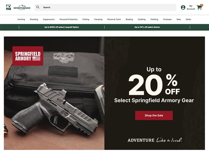
Sportsman's Warehouse uses powerful imagery to keep visitors focused.
Your Website Is Selling Before Checkout
Retailers already understand merchandising inside the store. What customers see first matters. What catches their attention matters.
The same thing happens online.
Sportsman’s Warehouse (West Jordan, Utah) is a strong example of that. The homepage is highly visual, clean, and easy to scan. There’s minimal text, strong product imagery, and clear hierarchy, making the experience feel approachable rather than overwhelming.
That matters because people tend to stay longer when shopping feels easy and intuitive.
Even smaller details are doing work. Free shipping is communicated early, answering a common question before it becomes a hesitation point. Their “Deals” navigation item is highlighted in red, helping bargain-focused shoppers quickly spot exactly where they want to go.
Most visitors are not reading your website line by line. They’re scanning for cues.
Once customers move into product categories, the experience stays organized. Filters help narrow choices quickly, products are shown cleanly, and pickup or shipping options are easy to spot. That kind of structure makes a large inventory feel manageable instead of exhausting.
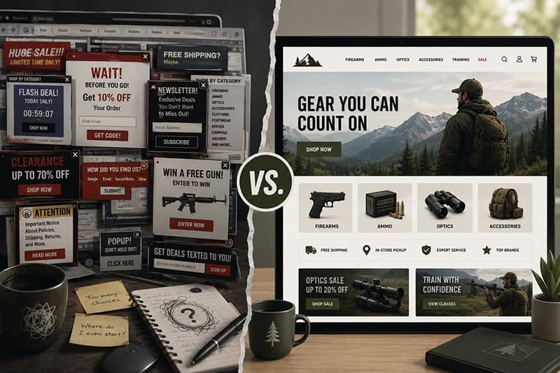
Cut the clutter. Make it easier for customers to find answers.
What This Adds Up To
Customers are not judging your website like designers.They’re asking much simpler questions.
Can I find what I need? Do I understand what happens next? Does this business seem like it has its act together?
A clear website builds confidence before anyone walks through the door.
And the encouraging part is that many of these improvements are practical, not massive. Better visuals. Clearer explanations. More thoughtful organization. A few intentional changes can make the experience dramatically easier for customers, which can absolutely influence whether they stick around, come in, or buy.
Get more Dealer Advantage every week!
By submitting this form, you are consenting to receive marketing emails from: . You can revoke your consent to receive emails at any time by using the SafeUnsubscribe® link, found at the bottom of every email. Emails are serviced by Constant Contact